Teaching Graphic Design
I’ve been teaching in the BFA graphic design program in the Gwen Frostic School of Art at Western Michigan University since 2001. As an Adjunct Assistant Professor of Art, I’ve been teaching form and typography courses in the design curriculum. I’ve also taught exploratory courses in time and place storytelling. We accept 20 students into our three-year program each year, thus maintaining an enrollment of approximately 60 students. Each semester, students take at least two graphic design courses. Here are highlights from four of the courses I’ve taught: Graphic Form, Typography I and II, and Graphic Design for Non-Majors.
Graphic Form
I’ve taught Graphic Form for the past eight consecutive years. This course, for students in their first year in the program, explores applications of graphic forms that range from pictorial to symbolic. Graphic forms can sometimes communicate and express meaning more directly and universally than words or imagery. And they can be used to reinforce the meaning of words and imagery. Students take their first typography course during the same semester as this course, affording concurrent study of graphic forms and typographic forms.
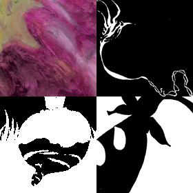
 In Graphic Form we begin with studies of organic forms, learning design process along the way. We study color, line, edge, shape, figure/ground relationships, and composition. We progress to geometric forms, and then to complex three-dimensional compositions. We learn how to communicate information with forms, and to create meaning with forms that express ideas.
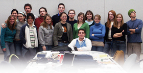
 I’ll introduce you to the Graphic Design Class of 2008 when they were sophomores Spring Semester 2006. Here are some samples of their work with graphic forms that semester.
We began with fruits and vegetables. Color studies are a good point of departure. (The previous semester, their first in the program, students took Visual Aesthetics and Color for Graphic Design.) Following color studies, we began to explore how form can be expressed in a series of black and white studies. First edge. Then shape. (In Photoshop, you could think of edge as “stroke” and shape as “fill”.) Then figure/ground relationships, modulating positive and negative shapes.
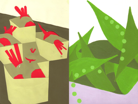 Based on these studies, students created color compositions of their fruit or vegetable as produce at the market. All studies to this point were hand drawn and painted.
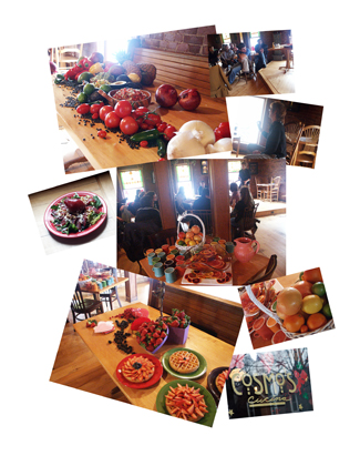
Moving to the computer, we continued with fruits and vegetables, considering now, how food is presented at the table. We visited a local restaurant to learn about presentation, which is, after all, as much about color, form, figure/ground relationships, and composition, as it is about taste.
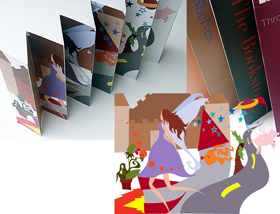 Enough fruits and vegetables (for the moment). We turned our attention to geometric forms and three-dimensional compositions. Students created compositions of graphic forms that visualized the essence of a space that was uniquely their own. Spaces included city spaces, living spaces, media spaces, and sanctuary spaces. Students learned to communicate information, express feelings, and tell stories with graphic forms in compositions that afforded viewer interaction.
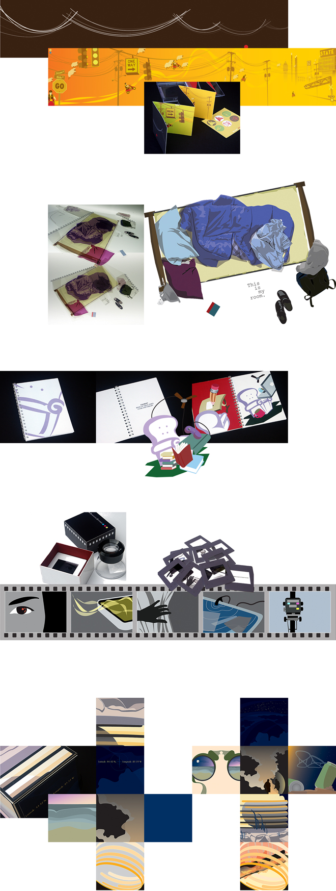
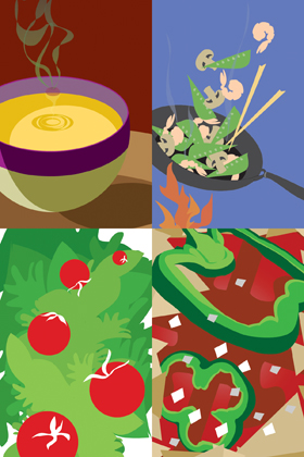
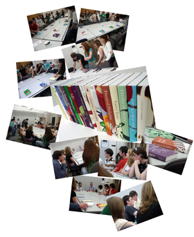 Following a couple of shorter assignments, we wrapped-up the semester returning to fruits and vegetables, in a collaborative project with another instructor in their concurrent typography class. Each student designed a book jacket for a collection of recipes titled: “A Taste of . . .” based on fruit and vegetable compositions earlier in the semester. Students learned to integrate graphic and typographic form in a three-dimensional composition.
These are highlights of one class, one semester. A great value of teaching the same course year after year is the opportunity to continue to develop content. The projects above all worked quite well, and I’ve had good success with several others. I’ll add more examples here from Graphic Form as time permits. For now, let’s move on to typography.
Typography I
As the fourth generation of Kunze family enterprise in the graphic arts, my passion for printing and typesetting is innate. I still have a Vandercook Number 4 proof press and tons of foundry type collecting dust in my studio. Thus, it has been especially meaningful for me to teach courses related to typography during the past nine years.
This semester (Spring 2010) I’m teaching Typography I for the first time, after years of teaching Typography II. This course, for students in their first year in the program, introduces typography, focusing on words and sentences. As mentioned above, students take Graphic Form this semester, affording concurrent study of typographic forms and graphic forms. (You’re invited to follow along during the semester. Please check back here every week or so for updates!)
(The Graphic Design Class of 2012 will have access to a class blog that includes notes, resources, assignments, and feedback through the link on this page.)
Please meet the Graphic Design Class of 2012.
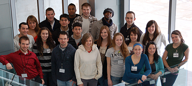
The class began learning how various typefaces can express meaning by designing nametags in hand-drawn typefaces that communicate something about themselves.
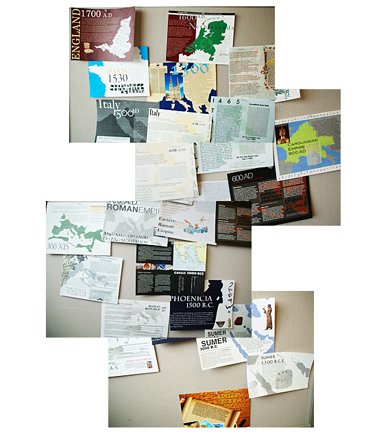
I begin Typography I with a study of pre-typography – I call it Typography 0 – because it is important to know where the typographic forms we use today originated, from the Mediterranean to Europe (as best we know now). Students map the origins of the phonetic alphabet (including antecedents, the evolution of writing, and the evolution of early type forms) by time and place over about five millennia, noting important evolutionary milestones like serifs, distinctions between uppercase and lowercase forms, and punctuation.
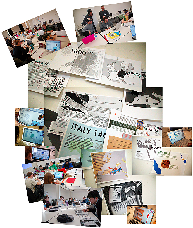
We worked interactively – individually, in small groups, and as a class, discovering why each evolutionary step in the development of our type forms occurred when and where it did. We mapped and discussed what we learned, then presented our findings as an array of data.
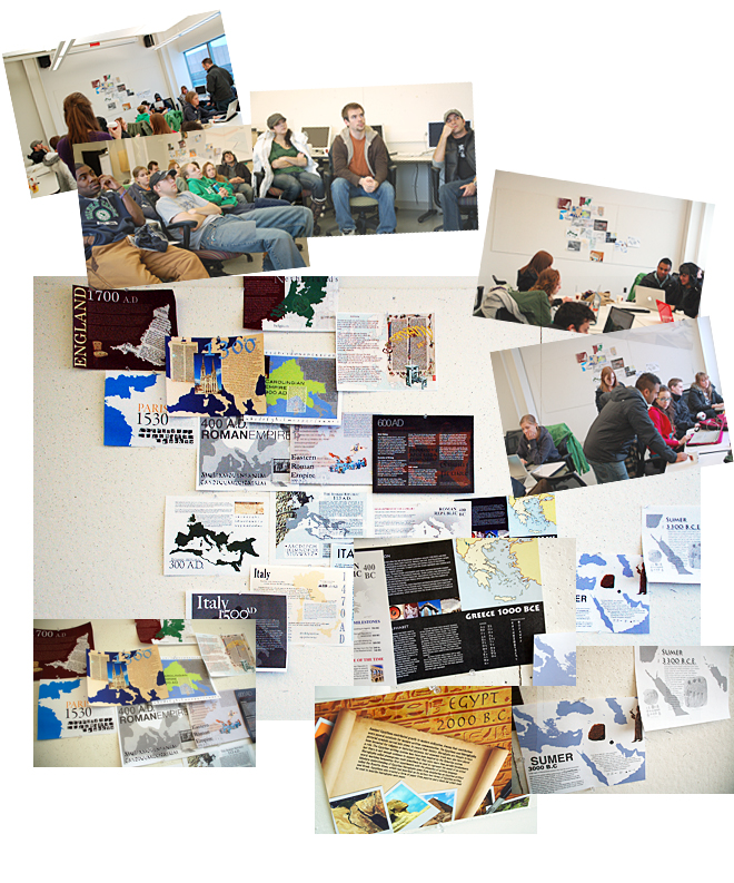
We’re leaving the data array pinned up as a reference for the next couple of assignments.
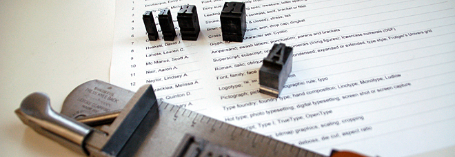
As we learn about the origins of our alphabet and study typographic form and structure, we learn a vocabulary of typography. There are terms that describe and distinguish letterforms, fonts, and typeface families, terms that we use in composing type, and terms for measuring type. Some terms are precise, some vary with context, some are archaic. Students study, visualize, and integrate these terms into their vocabulary throughout the semester.
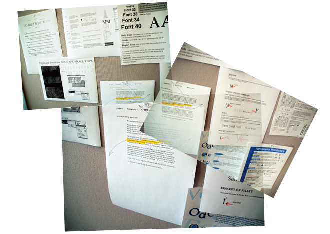
With an understanding of when and where type forms originated, and how to talk about type and typesetting, we’re now ready to begin thinking about creating meaning with type. We create meaning with words, sentences, paragraphs, and other arrangements of letters, numerals, and glyphs. Content is message. Typeface is voice. Creating meaning with message content and typeface voice is graphic design. Finding the right voice for a specific message is art and craft.
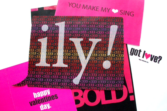
A typographic Valentine wish seems like an appropriate assignment in February to explore voices and messages. We began by looking at “The Graphic Imperative”, a current exhibition of posters in our school galleries, selected by Elizabeth Resnick, Chaz Maviyane-Davies, and Frank Baseman. We talked about how type and form create meaning. We talked about Valentine wishes. Please check back on February 14th for a Valentine Wish from the Class of 2012.
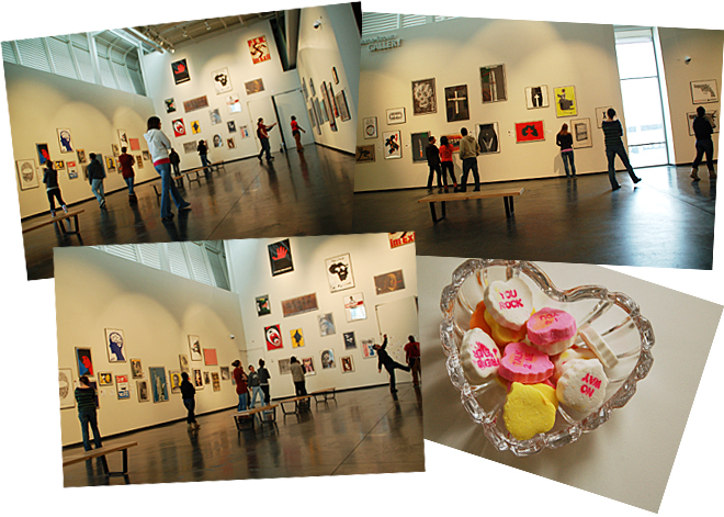
Happy Valentine’s Day from the Class of 2012 !
Finding just the right voice among the myriad typefaces available today is challenging, and it is useful to have ways of sorting typefaces into voice categories. For more than a century people who work with type have sorted typefaces historically (old style, transitional, modern, etc.). Historical classification schemes worked well for a long time, and it is difficult for designers of my generation to let go of them. But there are new voices these days. New typefaces, and another generation of designers using them, expressing meaning with new and different voices.
Thus, we consider postmodern typeface taxonomies, along with historical ones. I challenge students in Typography I to invent their own typeface taxonomies. I began this assignment by asking students how they organize their stuff. How might they classify typographic stuff?
Students begin with a deep dive into about 125 typefaces that are provided – an immersion in type history and form – putting names with faces on paper and on screens. Taxonomies are invented and discarded and reinvented.
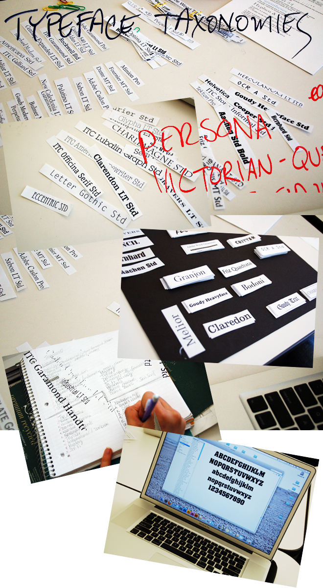
Some students began exploring cognitive and conceptual metaphors, developing what could be called folk taxonomies for grouping typefaces – ranging from personas and personalities to literature genre and gaming. Other students decided to explore historic hierarchical taxonomies – ranging from traditional ones to a film noir treatment. Most importantly, students are studying typeface forms, creating personal meaning and associations in the context of what they’ve learned about the historical evolution of writing and typesetting.
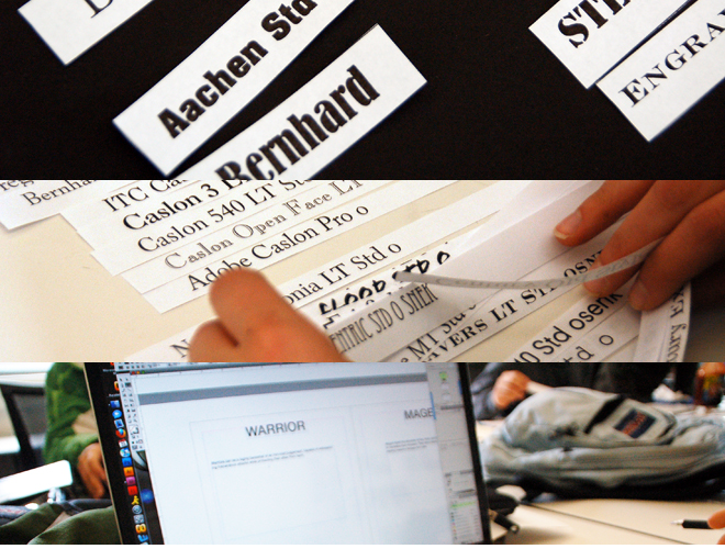
Next week is “spring” break (with about a foot of snow on the ground here), so please check back in a couple of weeks to see how our taxonomies are evolving…….
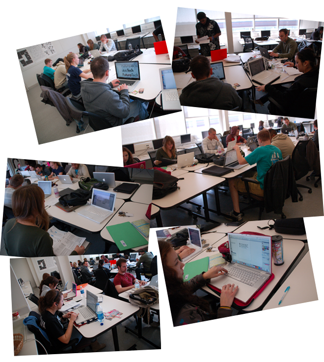
We’re back from spring break now (I like to think of spring break as a student field trip opportunity for observing typefaces – yes, some students did!). Our snow is almost gone, and if you look closely, you’ll see one student in shorts! You’ll also see the new window shades installed in our classroom over break, making screen viewing and picture taking a lot better.
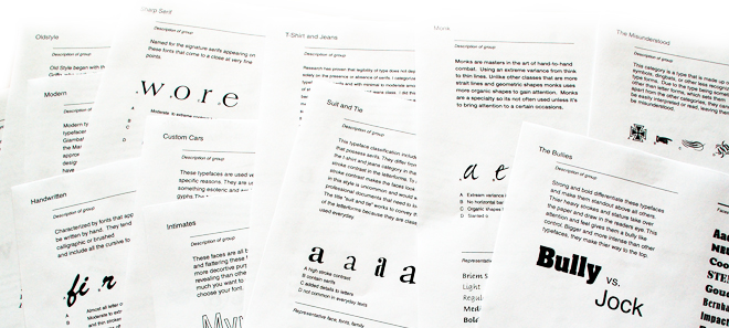
We’re making good progress on taxonomies. Students are writing descriptions of their typeface groups. By now you may be wondering what a “Warrior” typeface is – well, you’ll have to ask Dave (he’s the one in shorts)…..or stay tuned…..
While working on taxonomies, we’re beginning another assignment that continues our exploration of creating meaning with type. In this assignment, students design a logotype for a fictitious company using an autonominal (self-naming) typeface. This assignment is called “Designer’s Dream”. We begin by looking at typographic logotypes that students find in the wild. Students are asked to think critically about how well the logos work – we classify them as “hall of fame” or “hall of shame”. Next, students will invent company names to associate with typeface names of their choice.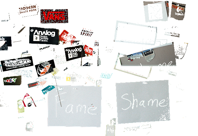
Here is a sample of what some students invented. Do you think that designing logos for these companies would be a designer’s dream? Do you think that the old style typefaces Brioso and Sabon look like places to eat and drink? Do you think that the old style typeface Galliard with its lowercase italic “g” looks like dance? Does the humanist typeface Gill Sans look like a fish market? Do the geometric typefaces Futura and Bauhaus look like technology and design?

This was a quick assignment, but a meaningful one to become acquainted with typographic logo design, creating meaning with letterforms, and spatial relationships among letterforms and words.
Here is a sneak peek at what one one student is working on for the next assignment.
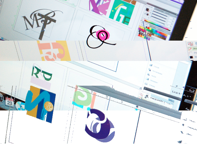
This assignment brings us back to the metaphors that students are exploring to develop their folk taxonomies for grouping typefaces – looking at letterforms as graphic forms. Students create compositions of letterforms that express the essence of their typographic taxonomies, demonstrating their understanding of the distinguishing characteristics of their personal folksonomies. For example, the range of a wardrobe folksonomy includes compositions of Helvetica, Fournier, Arnold Bocklin, Herculanum, Americana, Tekton, and Futura letterforms to visualize four classifications: T-shirt and jeans, costumes, hand-me-downs, and uniforms. Another composition of letterforms visualizes four typeface personalities: perfectionism, open mindedness, self control, and elegance. Another composition of letterforms visualizes four career types: business professional, historian, computer programmer, and elementary school teacher. Next week students will begin assembling type specimen books of their taxonomies.
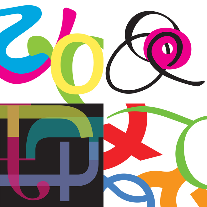
You’ll see more of these letterform compositions on the covers of students’ taxonomies when they’re completed. Students are also collaborating on a tag cloud of their taxonomic groupings – looking very interesting! I’ll post some of that work here soonest. In the meantime we’ve begun working on the next two assignments.
So far this semester, we’ve looked at how our alphabet evolved, how it was chiseled and written, how it was cast in lead, later in raster graphics, and printed on paper, and how we see it today rendered as dots on screens. We’ve studied this evolutionary process over five millennia, learning how one incremental step led to another. And how a typographic vocabulary evolved. We’ve considered typographic form, voice, and meaning in a series of assignments. Now, for the rest of the semester we’ll apply all of that learning to working with words and sentences.
Words are typically the first building blocks composed of letterforms. Thus, we leverage all of what we’ve learned about letterforms this semester compositing letters into words to create meanings. We’re working with words that represent sensory perceptions. Students create meaning with words that describe or relate to the six senses. Students use six typographic variables. In class we laid out an array of more than 100 combinations of sensory perceptions and typographic variables. We talked about different ways typographic variables communicated something about the senses.

Here are some of the semantic word interpretations. Students used primarily one typographic variable to communicate something about one sense in one square. Reading across, the senses are: sight, sound, taste, smell, touch, and intuition. Reading down, the typographic variables are: type size, weight, letter style, letter spacing, orientation, and position.
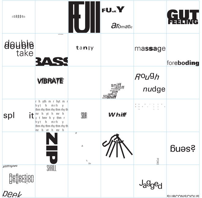
Notice how different type styles can make a vibrating sound, how letter spacing can create rhythm sounds, and how zipping sounds are usually oriented vertically. Notice how type size can almost make a word almost disappear, and a smooth change of type weights can feel like a massage. Notice some of the other interpretations. Students worked with only one word (and repetitions of words), one sense, and one typographic variable in each square. I’ve combined a few words in squares here and there to show how, for example, positioning in the square can look like a glimpse, peek, or reflection. There seemed to be some obvious associations of typographic variables with the six senses, with several good solutions in the class for several associations. The empty squares, though, represent variables and senses that were not associated by students. Can you think of a sound that could be visualized by type size?

Students also created a seventh composition (above) using more than one typographic variable to communicate something about one of the senses. (We called this one the everything-bagel.) Notice now, for example, how type size and position can smell like a dump, and how size and position and style can feel like a tickle. And notice how varying type style as well as letter spacing can turn rhythm into babble.
Sentences are composed of words. In our last assignment for the semester, we’re working with what I call standalone sentences. These are sentences that may appear on posters or billboards, as headlines or banners. Sometimes these kinds of standalone sentences are associated with body copy, and sometimes not. In the current assignment students are presenting opposing positions about a topic. The presentation of the sentences may represent the positions in either a balanced or weighted manner. Students may write the sentences or find quotes about topics.
We’re now into the last week of the semester – always a busy time! While students continue working on their sentences, they’re finishing their typeface taxonomies and contributing to our collaborative typeface taxonomy tag cloud. A class from Van Buren Technology Center also visited us this week. We had some interesting conversations and some fun. Thanks for your visit, we enjoyed meeting you!
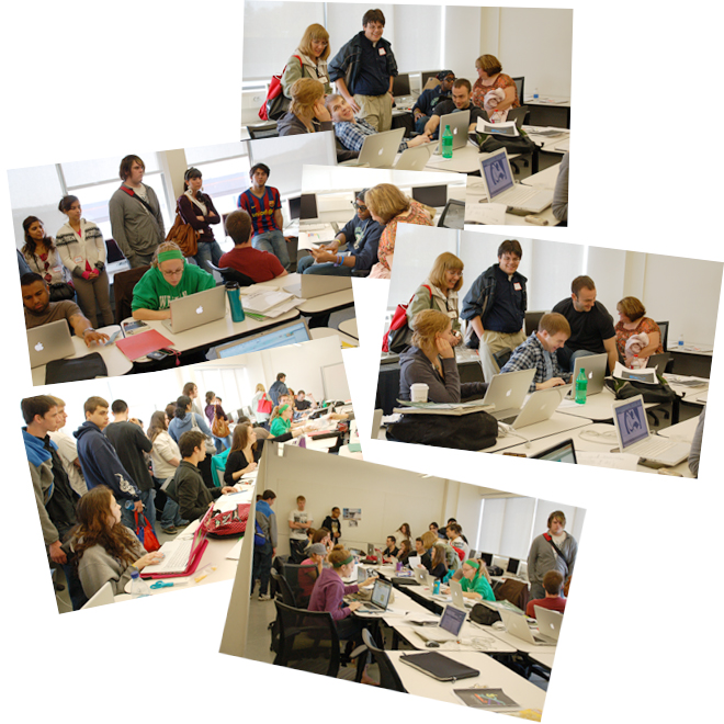
Today was our last regular class of the semester. Many typeface taxonomies have been submitted (recognize the career typology letterform composition?). Our tag cloud is taking form. I presented perfect attendance awards (six, count ’em!). Students opted to have their final written exam today instead of waiting until finals week, so that next week we’ll be able to kick back and savor the accomplishments of the semester.
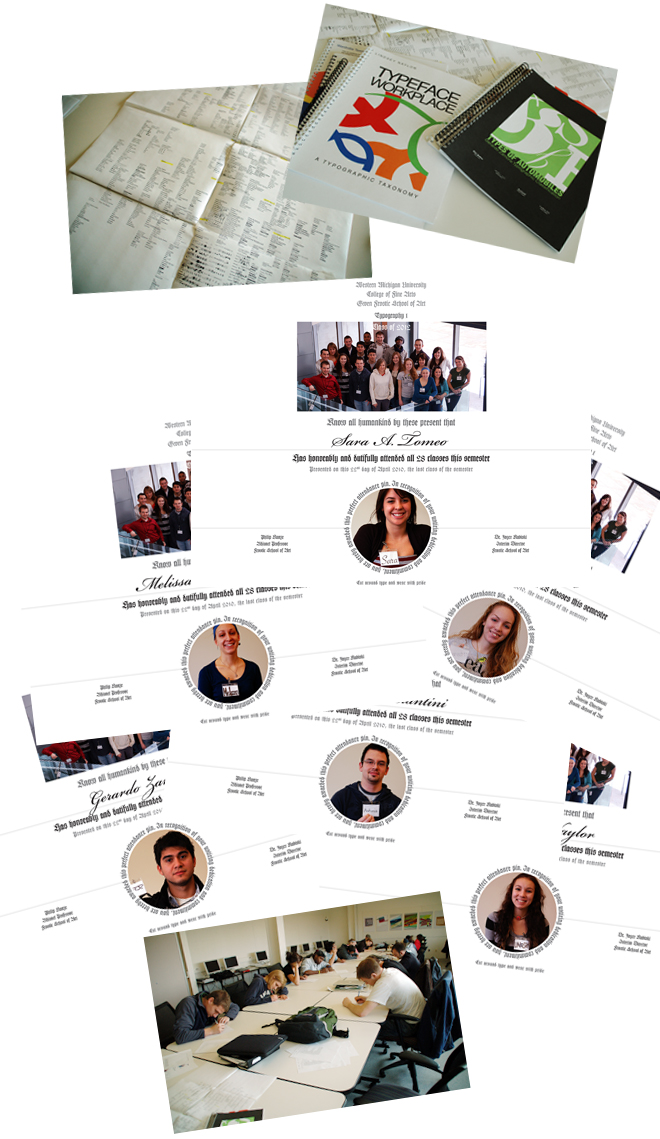
We accomplished a great deal this semester. During finals week we had an opportunity to look back. I called this the “long view” because we laid out most of our semester’s work, informally, on the long row of tables in our classroom – an instant replay of the semester. We looked at how our origins of the alphabet and movable type led to the development of a typographic vocabulary, and in turn, to typeface classification schemes that have been evolving for more than a century. We looked at students’ personal typeface taxonomies alongside historical ones, and at the collaborative tag cloud of our taxonomies. We looked at our just-completed sentences. We talked about letterforms and creating meaning with type. We talked about how our alphabet and letterforms evolved over five millennia, and will continue to evolve (at an accelerated rate) during the graphic design careers of the Class of 2012.
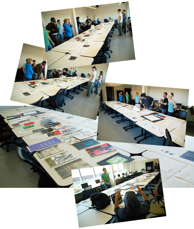
I asked for feedback and ideas for improving the first type course for the class of 2013. I listened to some excellent ideas that I’ll find ways of incorporating. I asked for input on an idea for community building and mentoring in the graphic design program through typographic subject matter experts (TSMEs). The class supported the idea and I’ll write about it following this section before the next typography class.
We gave one another a round of applause, and then the semester ended quietly, with a few students lingering to talk.
I find the end of spring semester an interesting and gratifying time. The transition is so abrupt. After a rush of work during the last couple of weeks of the semester, the classrooms and studios fall silent, 20 students who have worked so intensely together in four courses during the past year head off in different directions, and I have the time to evaluate their portfolios of semester work (and, indeed, my teaching).
As you’ve seen above, the principal challenges in the first typography course are learning about how letterforms evolve over millennia, and learning how to use letters and words effectively to create meaning with type. All of this learning comes together in the last few projects.
Typeface taxonomies (as described way above) that we worked on much of the semester were central to this learning. Early in the semester, all students were provided the same 125 or so basic typefaces (plus some novelty and symbol fonts) to use in Typography I (and then again in Typography II). Students were to develop their own typeface specimen books for all of the fonts provided, organizing the typefaces in some logical manner. Students could group typefaces based on traditional historical classifications, or develop a personal taxonomy (that could be called a folk taxonomy or folksonomy). Students described their rationales for their individual taxonomies and the characteristics of each classification within their taxonomy, and then decided where each typeface “belonged”. Twenty different type specimen books were submitted. Their covers (below) include the name of their taxonomy and letterform compositions that visualize the distinguishing characteristics of major classifications in their taxonomies.
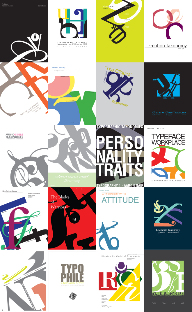
A sampling of their specimen books are linked to their titles in the paragraph that follows.
A couple of students based their typeface specimen books strictly on traditional historical classification schemes (you may be familiar with Oldstyle, Transitional, Modern, etc.). Several other students developed their own personal taxonomies based somewhat on traditional classifications. For example, Mykotype is a personal aesthetic interpretation of form with interesting variations of traditional classifications and terminology. Typophile is a film noir treatment of typographic obsession, based on traditional classifications, woven into an engaging story about type. Other students developed metaphors for classifying typefaces, for the same reasons we use metaphors in our everyday lives to perceive and make sense out of the world around us. Wardrobe Taxonomy poses a question about how typefaces fit into a wardrobe, and answers with a classification scheme based on use and style. Typeface Workplace asks what you want to be when you grow up, and answers with suggested career choices for typefaces. High School Cliques classifies type by personality and physical appearance, compares cliques, and identifies their leaders. We invite you to browse this sampling of field guides to see how the Class of 2012 will identify typefaces in the wild. These students have grown up digitally, and will continue to define and shape their world of digital graphic design in ways that are relevant and meaningful to them — as the evolution of letterforms continues during their professional lives.
Now, about those warrior typefaces that you saw above when students began classifying. Aachen, for example, is a Warrior in one student’s typographic taxonomy that is based on gaming character classes. (Aachen, a heavy slab serif designed in 1969, is generally considered a display face in traditional historical typeface classification schemes.) In other students’ taxonomies, Aachen is variously classified as boisterous, confident, a bully, a heavyface, a truck, workboots, etc. Get it? I don’t think any designer who has used Aachen would dispute personifications like those. It doesn’t matter so much what a student calls a classification — it matters more that students recognize how characteristics of letterforms inform their use.
As students completed their taxonomies, they added their typeface classifications to a collaborative tag cloud. This was an important next step that related the 20 different student classifications to one another. Beginning with a historic classification template, students positioned their unique taxonomic groupings where they seemed to “belong”. This is a work in progress, and will be continued in Typography II. Here is a sample crop that includes an area that we would traditionally consider gothic, geometric, slab serif, and display faces.
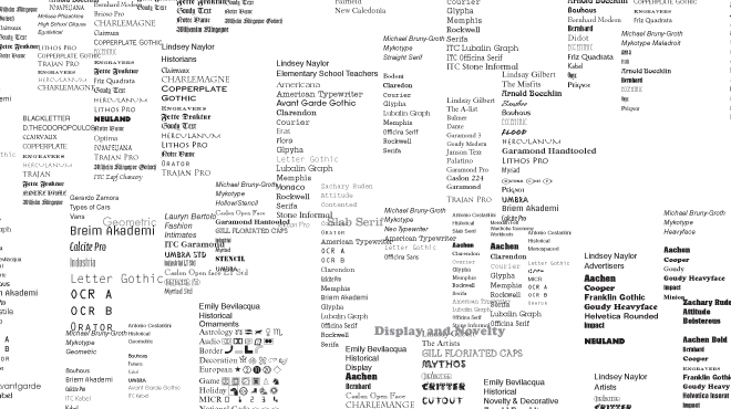
You see that Aachen, the warrior, shows up in the company of similar display and slab serif faces (workboots, advertisers, etc.) as you might expect. You also see some interesting twists and juxtapositions. For example, in the midst of some geometric faces you’ll find a fashion group called intimates (see-through faces that we would have been traditionally classified as outline or inline). There are many more interesting juxtapositions. That’s the point. I’ll post a more-finished version of the full-size tag cloud during Typography II. A completed poster of our tag cloud will then hang in our classroom. We’ll apply it as a tool for finding just the right voices for messages. Students will draw upon classmates’ insights into expressing meaning with type. (I’d like to establish an in perpetuity typeface taxonomy tag cloud from class to class if I can find appropriate software and if someone steps forward to develop.)
Expressing meaning with type brings us to our final project. Sentences about opposing positions or differing points of view were submitted on finals day. Students applied typographic variables learned during the semester to communicate messages – typeface selection, type styles, letter, word, and line spacing, alignments, composition, etc. Instead of a Web gallery (considering the size, shape, and scale differences among students’ sentence compositions), I’m posting three samples that visualize what this assignment was about. These details show how students found typographic “voices” for their speakers and visualized differing points of view.
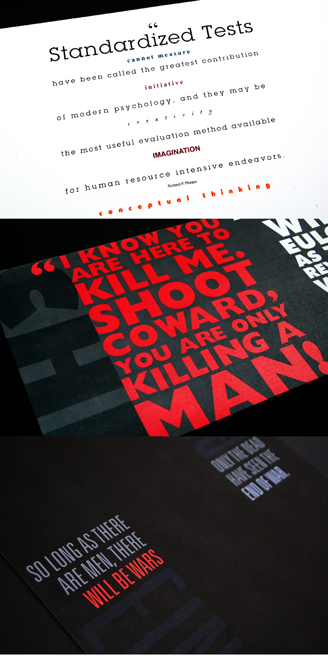
In the three details above, from top to bottom: Notice how obvious and carefully controlled typeface changes used with color, alignments, letter spacing, and line spacing express interlaced opposing positions in two quotes about standardized testing. Notice how a subtle typeface change, used with carefully modulated figure/ground relationships and color changes dramatically visualizes opposing sides and expresses the poignancy of quotes by Che Guevara and the CIA. Notice how the same typeface, used with alignment and color changes, and spatial relationships expresses two parallel commentaries on war by Einstein and Plato. Notice how juxtapositions of centered, justified, right-aligned, and left-aligned statements reinforce meaning in these three solutions. That just begins to describe the range of effective uses of typographic variables students developed in this final assignment for the semester.
These last few assignments demonstrate how understandings of letterform characteristics and compositions of letterforms contribute in very basic ways to beginning to create meaning with type. That’s what Typography I is about. This, then, is our point of departure for Typography II when we learn to create meaning with paragraphs, columns, and pages of type.
In the past I’ve documented student work throughout the semester in printed highlight books. Spring semester 2010 was the first time I posted a log of student work online. The above posts have been intended to visualize design learning process – not finished work. These posts also serve as a breadcrumb trail for students and me (and maybe a preview for prospective graphic design students). I hope that I have succeeded in those respects. Please send me a “Hey Phil” if you have any comments or suggestions!
At the moment I’m inclined to continue these posts of the Class of 2012 in Typography II in the fall. In the meantime, I’ll maintain contact with the Class of 2012 during the next few months with a sort of “summer school” through the student link. You’re welcome to follow along again here in the fall! I’ll leave samples of prior Typography II work below for a while.
I’ll digress a bit now with thoughts about community building and mentoring that I’d like to develop in the fall.
Typographic Community Building from A to Z
On finals day I asked students about the idea of developing typographic subject matter experts within our design program. Here’s how it would work……
Each student enrolled in each class in our graphic design program is assigned a registration number, alphabetically, by the registrar’s office. Thus, in any given year we have three sets of numbers from 1-20, totaling 60 students progressing through the program in three classes from sophomores to seniors.
As a community building and mentoring idea, I’d like to develop a programmatic way of connecting the three classes of graphic design students with one another through typography. Establishing 20 periods of pre-typography and typographic history, and 20 groups of vocabulary terms, and associating them with student numbers 1-20, would randomly and automatically create 20 groups of three students, one from each class. Each of these 20 groups would become typographic subject matter experts (we’ll call them TSMEs). They would learn from one another longitudinally and cross-sectionally as omni-directional mentors. All 60 students would learn from one another in somewhat structured ways.
Call it “standing on the shoulders of giants” – leveraging peer learning.
The Class of 2012 has expressed support for this idea. We’ll try it next academic year.
Here is my preliminary draft list (a work-in-progress) of subjects and experts. Each line in the subject column begins with an evolutionary tag representing a step in the five-millennium time span from the beginning of writing in about 3000 BC to the present. Each tag is followed by a few vocabulary terms. The terms are related typographically, more or less, historically or conceptually, to the evolutionary tags. The terms following the first slash are related more to Type 1; the terms following the second slash are related more to Type 2. (This is a skeleton list – students will be assigned several terms associated with each general subject area in Type 1 and 2.) Students will be challenged to discover relationships among their evolutionary tags and vocabulary terms – that is, finding meaningful connections. Students will discuss those relationships in class. Each student will become a Typographic Subject Matter Expert in assigned topics, and will be responsible for teaching that content to other students in the class. Each student in the junior class will also mentor a student in the sophomore class in that subject area.
TSME Subject
1 Cuneiform / early writing systems / modern symbol systems, logotype, TM
2 Hieroglyphics / pictograph, ideograph / ornaments, dingbats
3 Phonetic alphabet / phonogram / speech recognition
4 Greek alphabet / glyphs, ligatures / Greek and Cyrillic typefaces
5 Roman alphabet / serif, bracket, capital letters / readability, alignments
6 Square capitals / stroke, contrast, bowl, stress / aspect ratios
7 Rustic capitals / expanded, condensed / typo, stet, modern punctuation
8 Uncials / all caps, small caps / cursive
9 Half-uncials / ascender, descender, kerning / tracking
10 Caroline miniscule / majuscule, miniscule, early punctuation / paragraphing, drop cap
11 Gothic blackletter / uppercase, lowercase, U&lc / letterpress, WordPress
12 Venetian oldstyle typefaces / baseline, median, x-height, Roman, italic / ISBN
13 Garalde oldstyle typefaces / type foundry, body size, OSF / set width
14 Transitional typefaces / point, pica, leading, measure / type alignments
15 Modern typefaces / font, family, face / widow, orphan
16 Slab serif typefaces / hand composition, body copy, display copy / column inch
17 Grotesque typefaces / Linotype, Monotype, Ludlow / halftone, moiré
18 Neo-grotesque typefaces / ampersand, superscript / offset printing
19 Geometric typefaces / bold, light / perfect binding, emboss, die cut
20 Humanist typefaces / hot type, photo type, digital type / vector, bitmap, pixel
All three classes of graphic design students (first year, second year, and third year) will have opportunities to participate and interact with one another in groups of two or three students. Over time, as students progress through the design curriculum, as learning grows deeper and broader, as technologies evolve, as history is revised, as students develop projects and pursue design interests, all students will contribute to a larger and richer body of knowledge about these typographic subjects.
We’ll see how it works……….
Typography II
Welcome back to fall semester 2010! The Class of 2012 is now in their second type course, Typography II as we call it. The same 20 students you met above are beginning their second year in our graphic design program. By the end of this semester they will be halfway through the three-year program – and will have learned enough about design, typography, and workflow (along with InDesign, Photoshop, Illustrator, Flash, etc.) to take on increasingly complex design applications work in their second half of the program.
(As I mentioned above, I’ll leave a FLASHBACK to some examples of prior years’ work below this section while I add student work from the current semester.)
When we left off at the end of spring semester, students had learned their way from letterforms to words to sentences. We begin the second typography course with paragraphs of text. While we continue to focus on creating meaning with type, typesetting paragraphs and pages is very different from typesetting words and sentences – we are now about to work with a new set of typographic variables.
In the first type course, figure/ground relationships were concerned with letterforms; in the second type course, figure/ground relationships are concerned with paragraphs. In the first type course, we were concerned with spacing between individual letterforms, called kerning; in the second type course, we are concerned with spacing among letterforms in a range of text, called tracking. We’re concerned about spacing between lines of type, called leading. We’re also concerned about the shapes of paragraphs. These, and many other typographic variables (and the ways they are related to one another) are important as we advance from the first course to the second course.
Here again, is the Graphic Design Class of 2012 returning from the many different directions they headed four months earlier. Fall semester begins almost as abruptly as spring semester ended. For the most part, students had busy and, in some cases, life-changing summers (more about that later) and all were happy to see one another again!

Those four months of summer were a good opportunity for reflection – and forgetting some of what was learned during spring semester. To address both of those opportunities, and most importantly for nurturing and sustaining learning, I posted some eclectic suggestions for summer reading about organizing information, and an online “summer school” for students who were interested and had the time. (This was prompted by student inquiries at the end of the first type course about preparing over the summer for the next type course.) Summer school included work that students could begin in preparation for the first assignment, and suggestions for researching topics related to information hierarchy that we would be working on later in the semester. Most importantly, I stressed thinking critically about words, sentences, paragraphs, pages, and screens of text encountered in the wild during the summer.
We began the semester with a retake (as advertised) of the final written exam that the class took at the end of the first type course. I was gratified by the unusually small drop-off in retention – two students even scored higher than they did at the end of spring semester!
In order to understand the relationships among paragraph formatting variables, we work our way through a series of studies during the first part of the semester. Students work together in small groups and evaluate one another’s work.
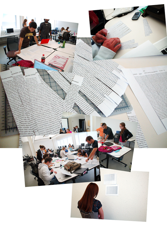
We looked first at type form coloration, learning to see how typefaces have a lighter or darker appearance as blocks of text. Students created a nine-step value scale (with as even a gradation as possible) using regular weights of the same typefaces they worked with last semester. This was a cut-and-past assignment that required a lot of squinting and studying. Students observed how x-height and other type form characteristics affect what we call the “color” of text.
But wait, party time! During the second week of the semester Dean Margaret Merrion closed the College of Fine Arts for a few hours one afternoon for pizza in The Arts Village – and to announce the sponsorship of original student works to celebrate the fortieth anniversary of the CFA during the 2011-2012 academic year. The CFA Legacy Collaborative Grants competition is intended to foster collaboration among art, dance, music, and theater in the college. Our class partied enthusiastically with the rest of the college – and the student (in the green shirt) who gave us “Warrior” typefaces last semester was seen strutting with the dean.

Now back to work – very important work: typographic alignments. Aligning type (as in flush left, flush right, centered, and justified) is not some arbitrary activity we do just because we can push words around with a mouse. Alignments have been an important part of communicating since the beginnings of recorded history, evident in the earliest writing systems. Marks pressed into clay, pictographs and phonograms, letterforms incised in stone and written on parchment, metal type, photo type, and digital type have always needed to be organized in various ways – alignments are an important part of organizing process. Typographic alignments structure information and create figure/ground relationships on a page or screen.
We looked first at alignment examples students found in the wild. Students worked in small groups again, discussing why some type alignments worked more effectively than others, how alignments relate to imagery on a page, and how alignments organize and structure information on a page.
Our studies began with the four basic alignments: left, right, centered, and justified. First thumbnail sketches, then columns of text. Working with a paragraph of copy and a specific type font from the first assignment, with specified letter spacing (called tracking), with specified type size and line spaces (called leading), within specified line lengths (called measures), and with specific hyphenation settings, students designed pages with columns of type. Primary considerations were figure/ground relationships and readability. This was the beginning of thinking about how alignments may be employed as compositional variables.
Again working in small groups, students selected the best examples of their bunch and pinned them up. We had an array of alignments and type compositions to discuss. Students could see differences in readability and why some alignments, measures, positions, and orientations felt more “right” on a page than others, and why some pages might attract and engage readers more than others.
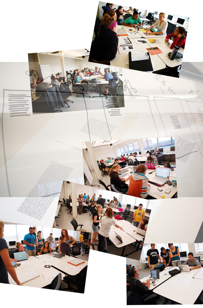
Next, we considered typographic texture, rags, and leading in another series of studies. These three typographic variables are related to one another, and to the coloration and alignment considerations that we had just studied.
Different typefaces create different textures in blocks of text. The visual appearance of these textures affects readability and contributes to one typeface feeling more right or appropriate to express the essence of a specific message. In the first type course when we classified typefaces by form characteristics (slab serif, boisterous, workboots, etc.) we were considering how type forms were related to historical evolutionary periods or to personas that they project. Now, in the second type course, we see that those same form characteristics (that differ from one typeface classification to another) also create different textures in blocks of text – affecting how they “feel” as text. Students set a paragraph of copy they had written at the beginning of the semester in eight typefaces from different historical classifications. They then wrote about how the form characteristics create different textures in blocks of text, and why one typeface or another looked more “right” to express the meaning of their copy.
Similarly, typographic rags and leading affect readability. When we set type “flush left” the right end of the line breaks randomly inside of the edge of the text frame creating an uneven appearance that we call “rag right”. When we set type in a specific size we also set the space between lines called “leading”. Both rags and leading affect readability and figure/ground relationships on a page in various ways. Rags and leading have a lot to do with visual artifacts on a page that affect readability. It takes students a while to develop sensitivities to those factors. Several iterations of the same (textures) paragraph (by varying rags and leading) and a critical peer review process resulted in an array of the best of four groups of students and eight typeface classifications. (Yes, these studies seemed a bit repetitive by now, but students maintained their good humor, occasionally signifying with hand gestures that they were learning something – or so I’d like to think.)
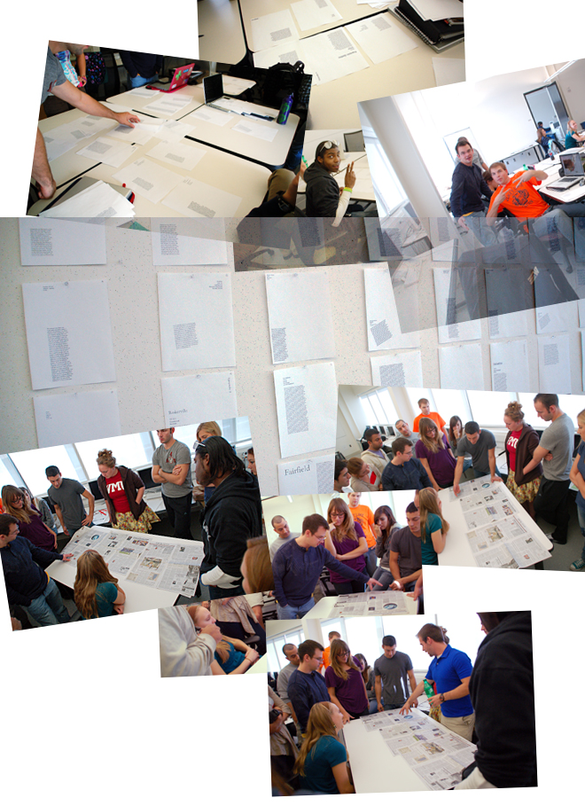
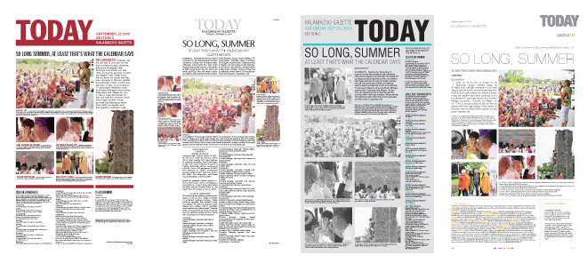
Then we looked at some examples of type coloration, alignments, textures, rags, and leading in the real world – a newspaper is a good place to start. The class engaged in quite an animated conversation about figure/ground relationships in the Kalamazoo Gazette in the context of those typographic variables.
The last typographic variable we studied is tracking. The space between letterforms (called letter spacing) across a range of text is called tracking. Type fonts have built-in letter spacing algorithms for every combination of letters. (Remember proportional spacing in typewriters? Remember typewriters?) Quite often we need to adjust the default letter space settings to enhance the readability of a specific typeface, type size, and leading combination in a layout. We increase or decrease letter spacing in a range of text by adjusting tracking.
In a series of nine more studies, students set one paragraph of the same copy in three different typefaces and two different alignments, all in the same size type and with the same leading. Students progressively varied tracking, hyphenation, and justification settings – and noted changes in character counts per line and the number of lines in each setting. Students could now begin to see how coloration, alignment, texture, rag, leading, and tracking variables work together, how to control them, and understand how tradeoffs among them affect readability in various ways.
Finally paragraphs! We began to look at how to break text into paragraphs – considering readability, figure/ground relationships, etc. Students started with conventional paragraphing, trying different depths of indents and amount of line space between paragraphs in flush left and justified columns of type. The idea was to find an appropriate way to signal a change of subject, pause, or break (something like inflection in speech), without interrupting the flow of copy too much, or creating distracting artifacts on a page. Then students experimented with other ways to break paragraphs – out-denting lines, indenting and out-denting whole paragraphs, staggering paragraphs, typographic rules, boldface, etc. Students then described how various paragraphing options worked for their typeface, measure, alignments, page composition, and story.
All of these studies may seem pretty tedious by now – just ask the 20 students – but they’re beginning to understand relationships among typographic variables in setting blocks of text, they’re relating them to creating meaning with type, and they’re becoming sensitive to seeing figure/ground relationships in blocks of text. It takes a lot of years of experience to really “see” these relationships, and more importantly, apply them in effective and creative ways.
A greater source of student tedium at this point though, was that students have been working with the same text block for a month – one that they had written at the beginning of the semester. During my online “summer school” I asked students to make notes about their summers. At the beginning of fall semester I asked them to write a few paragraphs about their summers to use for these studies.
(It is important for graphic designers to be able to write copy. I stress throughout the two typography courses I teach, that graphic designers, who are also typesetters these days, must also be copywriters, editors, and proofreaders. Even though today’s students will rarely work with these standalone professionals in their careers, it is important to know that they are discreet and essential steps in design workflow.)
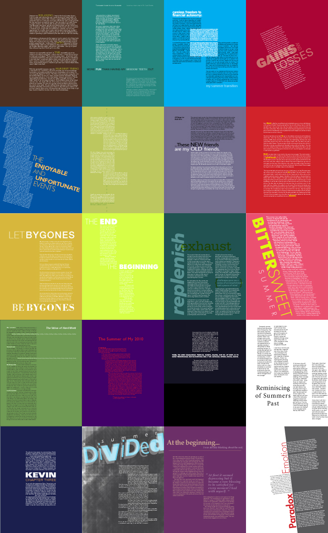
Now, about a quarter of the way into the semester, students composed a page of type about their summer vacations. As in the final sentence assignment of the first typography course, this assignment required two points of view. (On the one hand my summer was…, on the other hand it was….) Their summers were about gains and losses, working and relaxing, time well spent and time wasted, one engagement, and one marriage – as I mentioned earlier, some life-changing summers. This was the first assignment that required thinking about structuring information on a page – expressing a duality about summer vacation experiences. This assignment also demonstrated what students had learned from all the preceding studies.
While you can’t read the copy (or see how typographic variables are employed to create nuanced type treatments) in the work of the 20 students below, you can sense how typographic space, the effective use of figure/ground relationships, and thoughtfully considered (conventional and novel) paragraphing contribute to creating meaning. (As in some of the other samples on this page, the juxtapositions that result from alphabetic tiling and thumbnailing don’t do justice to individual student works, there isn’t room to accommodate all, sorry…….)
Speaking of summer vacations, we revisited that Kalamazoo Gazette newspaper we looked at a couple of weeks earlier. The first page of the “Today” section happened to be about saying goodbye to summer – something that the class was happy to do. I challenged students to redesign the cover page of that section, based on their comments weeks earlier.
This was not just a design makeover, but rather a reconsideration of information structure. Students take Visual Systems this semester, affording concurrent study of information hierarchy and typographic hierarchy. Typographic grid systems have a lot to do with structuring information on a page. As process steps, students took a deep dive into grid systems, they developed nominal three-level hierarchies of heads and subheads, and applied some of these schemes to the Kalamazoo Gazette page. Students used exactly the same page content as the original page. While the assignment was largely about head and subhead information hierarchies and typographic grid structures, students considered typographic variables, and were forced to make real-world tradeoffs among those variables. Students developed a number of very workable designs. We pinned them up and discussed how well they structured information, and leveraged typographic variables and figure/ground relationships to attract and engage viewers.

Now, the moment we waited for all semester – the punctuation workshop. Graphic designers who are typesetters, copywriters, editors, and proofreaders need to know how to punctuate. (Along with knowing how to spell, and a bit about syntax and grammar, but we have only so much time…….) Working mostly from Eats, Shoots and Leaves, a best-selling book on punctuation by Lynne Truss, we discussed the period, comma, apostrophe, semicolon, colon, and a few of the others. We had as animated a discussion about punctuation as we had about figure/ground relationships in the Kalamazoo Gazette. I should have known by now that this class could have fun with anything – even punctuation!

Up to this point we had been working with single-page documents only. Type – as information – also needs to be structured across multiple pages and multiple documents. In the next assignment we made connections between periods of design history and culture, as well as between pages in a document. Students explored areas of interest and developed content – copy and graphic forms – to tell engaging stories about their topics. Students applied all they had learned about typographic variables in setting text type, as well as structuring information across multiple pages with grid systems, and integrating type with graphic forms. Here is an array of cover designs……
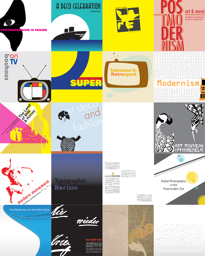
I hope you found some of these engaging. Here is a peek inside a few…….
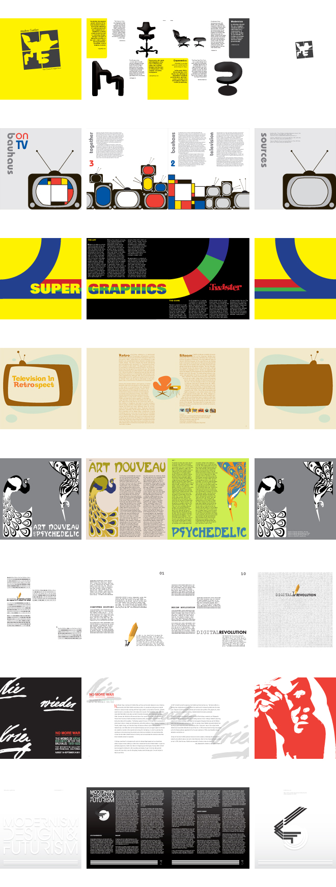
In each of the spreads, the front cover is on the left, followed by the inside spread and the back cover. Notice how an engaging cover draws you into a piece, how a cover establishes an expectation about what’s inside, how a grid system establishes structure and helps you find your way through a piece, how blocks of text relate to graphic forms, how color is used, and ultimately, how well each of these designs works.
This brings us to our final assignment, a free-choice project. I suggested areas of inquiry during summer school for those who wanted a head start: orientation, wayfinding, and identification systems; quick-start guides; experience mapping; and others. The learning objectives of this capstone assignment were: structuring and sequencing information in a multiple-document system; and communicating and creating meaning in complex typographic compositions.
As final assignments go, this was a relatively short one. I challenged students to invent projects of adequate information and typographic complexity to demonstrate what they had learned this semester, and that were achievable in about two weeks. Students wrote briefs that included descriptions of projects and communication objectives. The assignment required at least two separate and related components, an identifiable information structure, and integrated graphics.
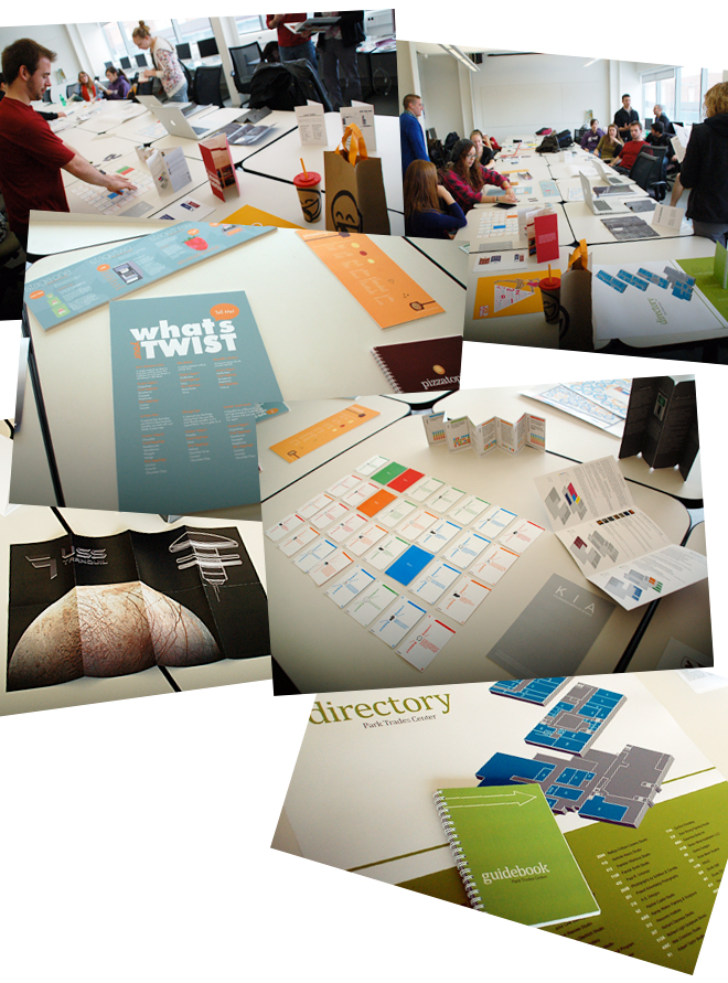
Like the final assignment last semester, the size, shape, scale, and format differences among students’ compositions preclude galleries of all. Here are three examples that visualize what this assignment was about, click on the links…….
These three examples demonstrate a great deal of typographic learning. Notice in these samples: how information is structured; how figure/ground relationships attract and engage; how typeface choices, sizes, alignments, and uses of other typographic variables communicate information; and how graphic forms reinforce meaning.
In each example I’ve included one piece of a system. Pizzatopia is about creating the perfect pizza experience – it includes a quickstart guide and booklet. The single pages in Pizzatopia appear as spreads in the booklet, sequencing ingredients (including friends) and steps (including enjoyment), all keyed with graphic forms. [Excuses] is a card game that includes instructions and 32 cards. The fronts and backs of [Excuses] cards, when arrayed in game play, tell a humorous story (in words and graphic forms) about making it through the day. Ecoplay is an event marketing promotion that includes a Website, quickstart guide, and a packet of event site-specific information.The Ecoplay printer spread of the site-specific information packet expresses the energy (in type, form, and photography) of a sporting event promotion.
The final presentation forms of this assignment ranged widely, from three-dimensional pieces and booklets that were trimmed, bound, assembled, etc., to posters and Flash files. While you can’t experience the physicality or temporal qualities of these pieces (and the PDFs don’t do them justice), I hope you’ll be able to sense how typographic sensitivities and decision making contributed to their overall effectiveness and success.
We ended the semester with more students attending every class than in the first typography course. I’d like to think that this was attributable to the fact that these students were now in their second year in the graphic design program with a keener interest in typography, but it probably had more to do with the fact that this was a 3:00 class rather than an 8:00 class. On the other hand, we had an exceptionally great number beautiful fall afternoons……
I again invited this class to participate in my community building and mentoring idea, engaging them in a way to make the next class even better than theirs, standing on the shoulders of giants, so to speak. I was ready to develop the Typographic Subject Matter Expert idea and posted the class grid of subjects and experts. The hope is that going forward, successive classes will build on current student work, and that we’ll build a collaborative knowledge base tailored to supporting the graphic design program. Everybody wins.
As I reviewed the work of the Class of 2012 from both semesters to prepare to teach Typography I again, I was reminded what a great class they’ve been to work with – and how much I’d enjoyed becoming acquainted with them. As a class, they were a very interesting mix of backgrounds, experiences, strengths, and skills that will serve them well in the graphic design program. They should become the best graphic design class ever!
In much the same way that we wrapped the first typography course, we looked at the long view of the last two assignments, and of the semester, on finals day. For students, the end of fall semester is different from the end of spring semester: they look forward to a short break, busy holidays, and the prospect of seeing classmates again in a few weeks. They are anxious to hit the road. For me, it is a goodbye of sorts. I’ll greet them in the hallways during the next year and a half and inquire about their current semester, but I’ll miss them, and wonder how their learning about typography is supporting them in their advanced course work in the program. I’ll have to wait until their senior show to see……..
Now it’s time for me to get acquainted with Graphic Design Class of 2013. As I said at the top of my Typography I post above, this year I taught the first typography course followed by the second typography course for the first time. I’ll be refining content a bit based on those experiences and student responses. I’ll document those changes and the Class of 2013 in the Learning Typography link to the left. (The Class pages remain password protected as a resource and feedback blog for current students.) Importantly also, you’ll be able to follow along to see how the Typographic Subject Matter Expert idea (“standing on the shoulders of giants”) is working out. I’m optimistic!
Now, I’ll jump back to some of the Typography II and Graphic Design for Non-Majors work from the past 10 years or so.
FLASHBACK………
Prior to the current semester, I taught Typography II six semesters during the past 10 years. I’ve typically begun with a series of studies similar to this semester, then move on to paragraphs, columns, and pages of text. Over the years I’ve varied the assignments, ending the course with a fairly complex assignment. I’ll leave the samples below that demonstrate the accomplishments of students over the years.
I’ve assigned readings from design history and criticism as a first major project several years. This assignment applies the learning about typographic variables, and adds considerations of information hierarchy, paragraphing, and page composition. The assigned copy is keyed in from print source material, so accuracy is an additional learning component. Designs need not be referential to design history, however many students draw upon their subject for inspiration, as you will see in the sampler from that assignment to the right. There are 20 pages in the booklet, compiled from the work of 20 different students spanning several years.
As students begin to understand how these typographic variables are used compositionally to attract, engage, and communicate, we explore a number of different kinds of applications. Some assignments include imagery and graphic forms to reinforce meaning. All require thoughtful typeface selection considerations, several paragraphs of text on a page, and a degree of information complexity appropriate for the assignment, demonstrating an understanding of uses of typographic variables. Some assignments focus on diagramming, grid systems, orientation and wayfinding, or other specific applications. I emphasize that graphic designers are now typesetters, and include a short section on punctuation and other topics that were commonly the responsibility of typesetters.
(Yes, there are typos and misspellings in the samples below. Not all projects are revised during the semester, and the examples shown here are not necessarily finished pieces. Students revise their work in their senior year for graduate presentations and portfolios.)
One application in recent years was a QuickStart Guide.
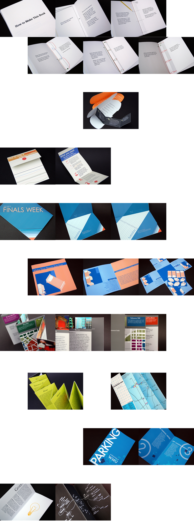
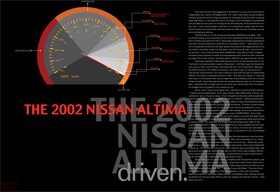 Another application, based on my marketing accountability work with buying cycles and use cycles is an experience mapping assignment. Students mapped: awareness, consideration, and purchase stages in buying cycles; integration, maintenance, and disintegration in use cycles. Students wrote about several different experiences, developed one into a story, and mapped those experiences. As you can see in this sampler to the right, solutions ranged widely, with many inventive visualizations of experiences.
Another experience mapping assignment was iMap, describing and visualizing how students in the class became interested in art, WMU, graphic design, and thoughts about where they might go from here. Assignment requirements and process were similar to the buying and use cycle assignment. The spreads below were assembled into folders or booklets.
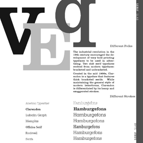 One semester we reviewed the historic evolution of typefaces and classification schemes by designing a split-page interactive type specimen booklet that functioned as a head/body compatibility guide. Students worked in teams, writing and designing half-pages that described and visualized type forms (different strokes) and type families (different folks).
Graphic Design for Non-Majors
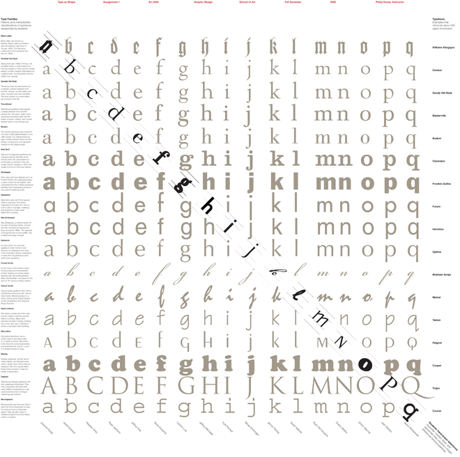
I’ve taught the graphic design introductory course for non-majors twice. This course is largely a typography course (a blend of Typography I & II), and I include a mix of Visual Aesthetics and Graphic Form course content. Thus, the concepts taught are similar to those above, including semantic interpretations, and the assignments tend to be basic practical communications applications. One noteworthy assignment a few years ago was a type specimen poster, below, that students contributed to (hand-drawn letterform and a historic blurb about their typeface). The poster chronicled about 500 years of typeface evolution, and visualized relationships among baselines, x-heights, ascenders, and descenders.


