

Class of 2013 Learning Typography
This page focuses on learning about typography. It is a Teaching Graphic Design spinoff of sorts. On my Teaching Graphic Design page I present an overview of the graphic design courses I’ve taught at Western Michigan University during the past 10 years. On this page I present successive classes of students learning about typography.
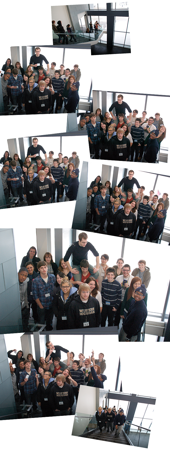
Please meet the Graphic Design Class of 2013! They’re beginning the Typography I course…….

These photos were taken on class picture day, a tradition I’ve established for the second class of the semester. As in past years, we began talking about typography by learning how various typefaces can express meaning. Students designed nametags in hand-drawn typefaces that communicate something about themselves. Their understanding of the “shoulders of giants” (a design community building and mentoring that idea I discussed on my Teaching Graphic Design page) is already apparent. And I’d like to think that their “Look! Up in the sky! It’s a bird! It’s a plane! It’s Superman!” pose suggests their typographic aspirations. Now, back to typography………
Beginning to learn about typography this year (Typography I, Spring 2011) will be similar to last year, beginning with origins of the alphabet and the evolution of typefaces, followed by a vocabulary of typography – however this year, we’ll merge the topics into a series of short assignments. We use two textbooks for all three courses in our typography sequence: Typographic Design: Form and Communication by Rob Carter, Ben Day, and Philip Meggs; and Thinking with Type by Ellen Lupton. I draw on them selectively in teaching the first two courses, while not following them sequentially for course content. Both are excellent books with many good examples, and serve students well as resources and references.
Like last year, we’ll be doing a lot of small-group work to foster discussions and peer learning. The class divided into four groups of five students each to explore four eras of origins of the alphabet and the evolution of our Roman type forms:
The evolution of the Roman alphabet, spanning about 3000 years, from the Cradle of Civilization
The evolution of writing, spanning about 1500 years, from the Roman Empire
The evolution of Roman typefaces, spanning about 300 years, from the Renaissance
The proliferation of typefaces, spanning about 200 years, from the Industrial Revolution
In each group, students researched milestones from cuneiform scripts to humanist typefaces individually, and their eras collaboratively. Each student is becoming a Typographic Subject Matter Expert (TSME) in specific subject areas. For example, one student is becoming an expert on typographic innovations during the Renaissance in Italy in the early 1500s; she is becoming acquainted with Centaur (a typeface designed by Bruce Rogers in the early 1900s and generally classified as a Venetian oldstyle); and she is learning why terminology like x-height, Roman, and italic are useful in describing typefaces and why these terms could be associated with her assigned time and place. Similarly, all students have an assigned time, place, character of the alphabet, typeface and historical typeface classification, and vocabulary terms for which they have a TSME responsibility. Students and groups share what they’ve learned with the class.

If you had been following the Class of 2012 in the first two typography courses last year (on my Teaching Graphic Design page), you may notice a couple of familiar faces on this page. Michael and Lindsey in the Class of 2012 are now TypeTechs this semester in our Typography I class. They are helping the Class of 2013 with InDesign type tools, troubleshooting tech stuff, etc. You’ll be seeing more of them working with students this semester (as above and below).
In the top photo below, the evolution of the Roman alphabet group is on the left, and the evolution of writing group is on the right. The evolution of Roman typefaces group begins with a German blackletter (“n” set in Wilhelm Klingspor Schrift) typeface before heading down to Venice and the Renaissance. And the proliferation of typefaces group begins with a slab serif (“s” set in Clarendon) typeface associated with the Industrial Revolution and brings us to the present with geometric, neo-grotesque (“v” set in Helvetica of course), and humanist typefaces.

The 20 evolutionary steps that we’re working with (a letter form panorama of five millennia and a typographic panorama of five centuries) span the important development of letterform characteristics that we are familiar with today. Importantly also, 500 years of metal typesetting and letterpress printing have bequeathed to us the vocabulary we use today to set type digitally. This vocabulary is not always easy to understand as we touch letters and words only with keystrokes and mouse clicks. The vocabulary is a lot easier to understand when we can touch letters and words physically.
We are fortunate to have the Kalamazoo Book Arts Center (KBAC) here in town where handset type and letterpress printing are alive and well, and where we can physically touch letters and words. Our class visited KBAC to enrich our understandings of the vocabulary we use to talk about type. Director Jeff Abshear introduced us to KBAC, explained papermaking, printmaking, handsetting type, letterpress printing, and bookbinding. He talked about how confluences of technologies over the years advanced these arts, crafts, and trades. He talked about the physicality of metal type. He talked about how the physicality of the impression of metal type in paper is different from offset printing. And he talked about a revived interest in handset type and letterpress printing these days.

Picking up where Jeff left off at the Kalamazoo Book Arts Center, our next stop in learning about the physicality of type was the Frostic School of Art woodshop.
The process of making the physical metal type we’ve been learning about up until now begins with punchcutting. It is a subtractive process wherein metal is cut away from the end of a steel bar to form a letter to create a punch. Through the process of typefounding and printing, a letterform alternates from negative to positive, right-reading to backwards-reading – from punch to matrix to cast letterform to print. These aspects of the geometric physicality of type are relevant to an understanding of digital typography today.
We simulated the 3D as well as 2D properties of type using a “computer numerical control”, or CNC, router to create oversize blocks of type for demonstration purposes.
Here’s how it worked. Let’s take, for example, the letter “n” in a form known as blackletter. Blackletter is an important form because it was a manuscript style in use for centuries in Europe during the middle ages. Liturgical scripts of Gutenberg’s time were written in a formal version of blackletter called textura. So Gutenberg based his type forms on textura. Thus, blackletter was a pivotal form, linking the 4500 years of the evolution of the alphabet and writing we have been studying, with the following 500 years of typesetting. But I digress. Back to the woodshop.
Erika, our Gutenberg, took her blackletter “n” to the woodshop. Brad, our woodshop supervisor, instructed the CNC router. We watched (yes, a little like watching paint dry, but a lot faster than punchcutting). Way different from how Gutenberg did it more than five centuries ago, but conceptually the same – cutting away material to create a letterform. Students began to see how the 2D figure/ground spatial relationships of type, determined by geometry, still govern the typesetting vocabulary we use today.
Back in the classroom with her letterform, now being joined by other forms from other centuries, she researched blackletter and its cultural contexts. She also researched several vocabulary terms we use today that are related to the early days of typesetting, “uppercase” and “lowercase” (the majuscule letters were in the upper case and the miniscule letters were in the lower case in a typesetting shop – get it?). She then compiled what she learned into a page to contribute to a class booklet documenting the 20 milestone steps that we studied in the evolution of the alphabet and typefaces we use today. She also contributed her learning to a timeline that visualizes the five millennia over which those 20 evolutionary steps occurred.

Similarly, her 19 classmates played Baskerville, Bodoni, Garamond, etc., and saw their 2D letterforms transformed into 3D objects that they could handle and arrange. They had fun with the upside-down/backwards thing. They researched their assigned times, places, letterforms, and vocabulary terms. They began to understand what letterpress meant. They compiled and shared their learning.

We began to assemble a timeline of the four eras (origins of the alphabet through the evolution of our Roman type forms) that students studied collaboratively, the 20 milestones that students studied individually, and the vocabulary related to those eras and milestones.

As we refined our timeline, we found several typeface designs (among the limited number of typefaces we’re working with) that are based on milestones in the evolution of writing during the Roman Empire. But we focused more on the evolution of Roman typefaces since Gutenberg, as writing forms evolved into metal type. We talked about how technology and popular taste influenced the development of type forms over five centuries. We talked about the impact of the Industrial Revolution on those forms and the resulting proliferation of typefaces continuing into the twentieth century. We talked about the explosive development of typeface forms in the digital era. And we talked about how these students will see during their careers a greater demand for typefaces designed for digital displays than for print. From clay tablets to papyrus to parchment to paper to digital tablets, technology and popular taste influence the visual characteristics of writing and typographic form.

As we studied typographic forms, we left the first iteration of our timeline pinned up in the classroom – our point of departure for a deep dive into type form.

Type form is the voice of the speaker, as eloquent definitions of typography like “speech made visible” suggest. It is difficult to compare the type form characteristics of one whole alphabet to another, so we use a keyword or test word like “Hamburgefons” that contains the most significant form characteristics that distinguish one typeface from another. (You might call this the Hamburgefons method of comparative type form study.) Students composed specimen pages for the 148 typefaces we’re working with that include Hamburgefons, sample settings in 8,9,10, 12, 18, and 36 point type, samples of basic character sets, and samples of all of the type fonts in each family. It was very large-scale collaborative project (with each student responsible for specified pages) that got a little crazy at times, like when we couldn’t pull sheets out of the printer fast enough. But the specimen book that we’re working toward will be an invaluable resource for students as they begin to compare and contrast type forms this semester, and consider typefaces for setting blocks of text next semester. More about that later.

In the meantime, as students wrapped up work on their type specimen pages, we began talking about creating meaning with type forms. Typographic logos are a good place to start because logos that are devoid of graphic forms must communicate a lot of meaning in a few words of type. Students brought in examples of typographic logos they found in the wild, and explained why they thought their logos worked (hall of fame) or did not work (hall of shame). This is how we began our first assignment about creating meaning with the letterforms we’d been studying.
The assignment: design a typographic logo for America’s Favorite Pastime. Students exercised their imaginations to consider options for our favorite pastime (we all know, or course, what our real favorite pastime is, or was, as conditioned by history, culture, and media). Now it was time to invent a logo for what might be considered our favorite pastime these days. Students pinned up their ideas, ranging widely from Gaming to Zombeing, whatever that is, (and gluttony, soapbox oratory, myfacetweeting, torrenting, txting, etc.) – the beginning of a lively discussion, and a dialog about creating meaning with type.

Creating meaning with type brings us back to studying type forms and the pages students are composing for a type specimen book. After weeks of intensive typesetting and the craziness of printing 25 copies of 148 typeface specimen pages, the day finally arrived to share our work. (I can hear someone mumbling something about trees; I love them as much as you do, but trust me, there is no other way to learn this stuff.) Students laid out their pages on the center tables in our classroom, and all filed around the room to pick up a set of alphabetically arranged pages, beginning with the typeface Aachen. The physical process of handling typefaces alphabetically is important too, because that’s how they appear in type menus (as they used to appear in type specimen books provided by metal and photo typesetters).

Each student composed about seven or eight pages of specimens. The pages were assigned alphabetically by typeface and student names. So for example, here are Dave’s pages in the middle of the “C’s”. These pages happen to include one blackletter, one transitional, one modern, one slab, and three display typefaces. (Display faces were set as text too, in order to see what they look like – frequently not very readable, but sometimes a designer might want one of those voices for effect in a text setting.) The 148 typefaces that students worked with included the following numbers of faces in 10 historical evolutionary classifications:
5 Blackletter
3 Venetian oldstyle
17 Garalde oldstyle
14 Transitional
6 Modern
10 Slab
4 Grotesque
5 Neo-grotesque
7 Geometric
9 Humanist
And the following numbers of faces in 4 other traditional classifications:
13 Script
37 Display
5 Monospace
13 Ornament
(Please send me a “Hey Phil” if you’d like a complete list of the faces alphabetically and by traditional classification. They are all Adobe OpenType fonts licensed for student use from Adobe Font Folio. And students work in Adobe InDesign in our three type courses.)
The full-size specimen pages were printed 11”x17”, trimmed 1” on the right edge, folded back to 8½”x11”, and punched on the left edge for a binder. The right column of text type with 2 pt leading runs off the right edge of the page to afford overlaying side-by-side comparisons of coloration, readability, etc.
In addition to the full-size pages, students composed one-line specimen pages of their faces (as typesetters used to do). Twenty pages are quicker to look through than 148 pages.
Alphabetized typeface lists of collections of typefaces are useful for finding a face quickly if one knows what all of the cataloged typefaces look like. But with the many thousands of typefaces out there these days, and the many hundreds of typefaces that accumulate on designers’ (or anyone’s) computers, scrolling through menus of alphabetized typefaces to find just the right one isn’t very efficient when searching for a type family or form without knowing its name.
A more useful approach to organizing typefaces is grouping them into categories with similar form characteristics. Printers, typesetters, and designers have used those kinds of classification schemes for more than a century, and they’ve served us very well. Those schemes have been essentially historical because, as we’ve learned this semester, typeface forms have evolved historically. But with the proliferation of digital typefaces, form characteristics overlap among historical classifications, distinctions between classifications blur, and students (and instructors) find it challenging to visualize typographic form relationships among all those typefaces. Furthermore, because the variety of typeface voices is as varied as speaking voices, not everyone agrees on sets of common classification characteristics. So I encourage students to organize specimen pages in their books in ways that make sense to them and in ways that they’ll remember when they need to find just the right typographic voice.
While students composed pages for their specimen books, they thought about how to group their pages by form characteristics. The 148 typefaces that students worked with is a relatively small sampling of the typefaces they’ll encounter in the years to come. Even this small number of faces includes almost 1000 different fonts – a daunting number to become familiar enough with in order to find just the right face to express a specific meaning. That is, just the right voice to communicate a specific message. It is useful, then, to have a systematic way of grouping large numbers of typefaces by form characteristics. I call this a typographic taxonomy.
Each student developed a personal typographic taxonomy. Some of their taxonomies were based on traditional/historical classification schemes, and some ranged more widely, but the focus remained on letterform characteristics. Each student also designed a letterform composition to express the essence of each classification. These pages included a listing of all typefaces in that classification, and became divider pages in their specimen books.
Students pinned up ideas for taxonomies and letterform compositions, explained their rationales, and we discussed them. As I’ve emphasized since the beginning of the semester, figure/ground relationships in this class are essentially the same as those they’re concurrently studying in their Graphic Form class.

I expanded the scope of this assignment from Type 1 last year. (You can see last year’s assignment beginning with Typeface Taxonomies in the Typography I section on my Teaching Graphic Design page.) The focus last year was mostly on developing taxonomies. This year’s assignment was expanded to include listings of all fonts in families, glyph samples, and text samples in three type sizes in three line spacings. The taxonomy component of this assignment was also expanded to include designing divider pages. We discussed work in progress as a class along the way, and continued to refer to our historical timeline.
This was a very ambitious project (some students might say overly-ambitious), and students worked on it most of the second half of the semester, while working on a couple of other assignments. I’d like to think, though, that by the time students brought their finished type specimen books to class to share and to submit, most were beginning to understand the learning value of the project.

Students looked at one another’s specimen books, and we discussed strengths of various typeface classification schemes, and how they worked in specimen books. Whatever works! Students were learning how to find just the right typographic voice.
You see in the examples above how binder covers and spines, divider pages, tabs, and letterform compositions work together to express the essence of typeface classifications and help make typefaces accessible by form characteristics. These are all components of a cohesive visual system.
As the semester drew to a close, we took a last look back over all of the assignments, and I attempted to connect a few more dots. Students brought in their oversize blocks of type and I brought in some of my wood and metal type and a composing stick, and we talked again about the physicality of type. We talked about the physical spacing of letters and words, both as a review of Type 1 this semester, and as a preview of Type 2 next semester. We continued reviewing during the last week of the semester in preparation for the written final exam on the last day of class. Now, what does 10/12 mean? And what is a superscript?

We wrapped the semester with Your Personal Space, a typographic composition of letterforms, words, and sentences that describes a uniquely personal space.
Process steps included selecting and studying a space, writing about it, and sketching it in typographic forms. For example, the personal space of an avid sketcher is his sketchbook.

He successfully developed his ideas into a three-dimensional typographic composition, introducing viewers to his space and communicating how he feels about and experiences his space.

Another student expressed the essence of her personal space, her ice rink, by layering words, phrases, and sentences on pages of translucent paper, creating the appearance of ice. The pages sequentially describe practice, hard work, challenges, disappointments, triumphs – all part of her personal space.

Another student visualized her personal space as a person, place, and thing. Her expressive, amusing, and playful text, typeface selections, alignments, pagination, and information hierarchy work well to describe how she interacts with her laptop.

Students were learning to create meaning with type. Every semester seems to end with the same refrain: so much to learn, so little time! Despite the usual end-of-semester crunch, and my hopes for accomplishing a little more in Typography I, students had actually accomplished some work for their second typography course – I think the tradeoffs were worthwhile. Students composed paragraphs in different typefaces in different sizes and with different leadings in their type specimen books, a significant head start for Typography II. This is where students will pick up in the fall, working their way from paragraphs to columns of text to pages of text. As always, I hope this course has prepared them for that work!